 Web Development
 Mobile Development
 AI & ML Development
 Low-Code/No-Code Development
 React.js
 Vue.js
 Node.js
 Bubble
 Manufacturing Software Development
 Custom Real Estate Software Development
 Education Software Development
 Non-Profit Software Development
 About Us
 Team
Team Career


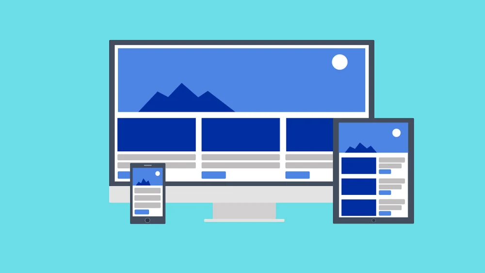
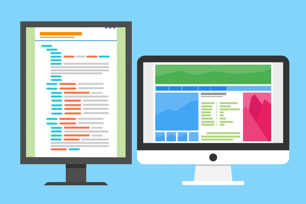
Responsive web design is a process of creating websites that dynamically respond to device specifications. It is a number one requirement for custom website development nowadays. Responsive design processes use three main components—media queries, fluid grids, and responsive media.
The term responsive design was coined by Ethan Marcotte in 2010.
Rather than tailoring disconnected designs to each of an ever-increasing number of web devices, we can treat them as facets of the same experience. We can design for an optimal viewing experience, but embed standards-based technologies into our designs to make them not only more flexible, but more adaptive to the media that renders them. In short, we need to practice responsive web design.
Upgrading existing sites can feel like a challenge, especially if you are not the original creator. However, it is possible with a little time and effort. For many sites, the steps below, which explain how to make a website responsive, can help you get started with the basics.
1. Determine How Your Site Is Used by Visitors
It is difficult to know how to adapt your site if you do not understand your visitors’ needs and preferences. You can gather this information through direct customer feedback or by using any site analytics you are currently collecting. User testing will also help you a lot.
Information to determine includes:
- What devices users are visiting on, including screen sizes, and resolutions. Different sizes and resolutions impact the usability of your layouts and media.
- What browsers your users are visiting with, including the version. Browsers and versions have different capabilities that you need to account for.
- How visitors interact with your site, including where time is spent and which features are most popular. Understanding which content users prefer helps you prioritize layouts.
Once you outline these requirements, you can go on to convert your website into a responsive version or create a mobile site from an existing website. Alternatively, if you are starting from scratch, you can build responsiveness into the layout from the beginning.
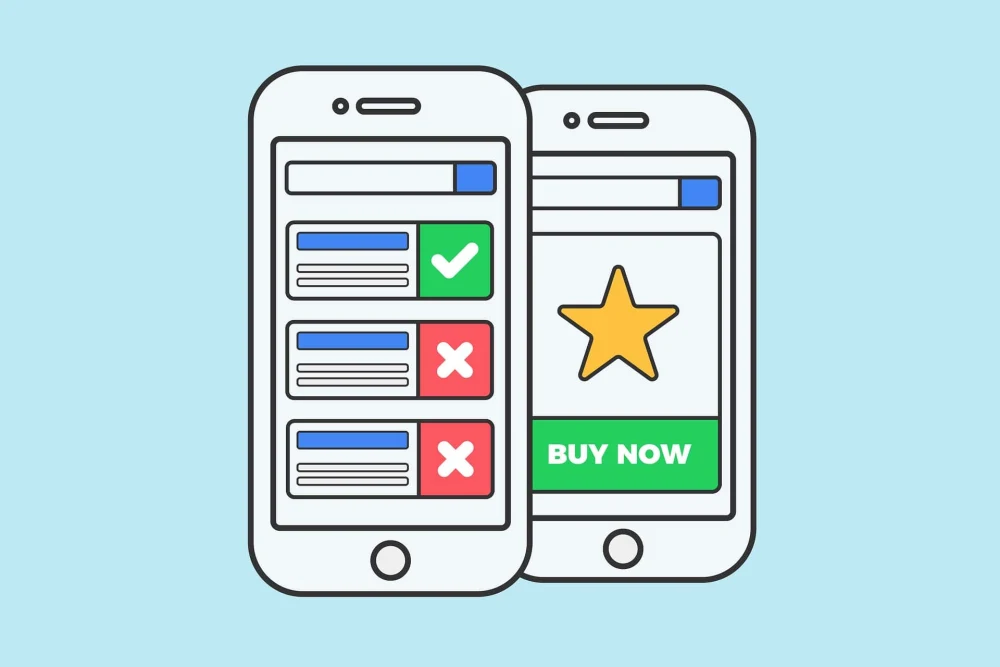
2. Make Images Responsive
Making images responsive means automatically scaling media to device size. The easiest way to make your images responsive is to set the image width in your CSS properties to 100%. This enables images to be shown on the full width of the screen without extending past the edges. If you have images that you only want to scale within a certain range, you can use maximum and minimum width properties to restrict the scaling.
To adapt your existing images, you need to find where your image is styled and ensure that your dimensions are not static. If dimensions are static and defined, make sure to remove the height property unless you also want images to scale according to height. To ensure a positive user experience, it is critical to make your images responsive. However, images are just one aspect. Making websites responsive involves more steps and tasks.
3. Include Media Queries
Media queries are used to specify alternative elements according to device size. You can use media queries to define different layouts, content, or styling. For example, you can deliver lower resolution images to smaller screens. This ensures the entire website’s layout is responsive, rather than only images.
Media queries are relatively easy to add since it only requires adding lines to your CSS. Your HTML remains untouched (unless you have styles defined in the HTML). To use media queries, you define specific breakpoints at which your styling is applied.
4. Define Your Breakpoints
Breakpoints specify minimum or maximum widths for which media queries apply. When defining your breakpoints, start with those device sizes that your visitors most commonly use. In general, it is good to have a breakpoint for smartphones, desktops, laptops, and tablets.
Common breakpoints include:
- 600px for small devices such as phones
- 768px for medium devices such as tablets
- 992px for large devices such as laptops
- 1200px for extra-large devices such as large monitors or televisions
Use breakpoints to make sites responsive for a wide range of devices.
5. Make Text Responsive
In addition to images, it is a good idea to make your text responsive. For example, while you may want large banner text on larger screens, it is not functional for mobile devices. When making text responsive, keep in mind how resizing may force your user to scroll and how other elements might be rearranged. Generally, for text-heavy sites or elements you should expand the size of the body to full device width for mobiles and tablets.
You can create responsive text by replacing static font sizes in your CSS with a vw value. vw stands for viewport width and functions like the percentage value for image sizes. You can use it in combination with built-in styling. For example, if you are using header or paragraph elements to define text sizes.
Alternatively, you can use media queries to define font sizes according to breakpoints. If you control fonts this way, you can also change the font as needed. For example, if you are using highly decorative fonts you may wish to change to simpler ones for greater readability on small screens.
6. Optimize Form Fields
Responsive forms can have a huge impact on the responsiveness of your site. When considering whether to adapt forms, take into account:
- How much text needs to be entered,
- Whether field locations are clearly tied to labels,
- How easy it is for visitors using touch screens to enter inputs.
One way to adapt forms responsively is to simply serve a different form via media query. To do this, you need to supply styling or source information in your media query object, the same as for images or text.
Another is to use the input type attribute included with HTML5. To use the HTML5 method, you need to add type=”{type}” to each of your form fields that you want to adapt.
This attribute enables you to specify the type of content that a field takes. For example, email address or phone number. Browsers that support this attribute can then use type information to optimize field layouts according to host device. For example, pulling up a keyboard when a user clicks on a text field or automatically adding .com to the end of URLs unless told otherwise.
Conclusion
Responsive web design has now become a requirement for ensuring a positive user experience. Responsive websites adapt to different devices, ensuring that users are served with the right version for their specs. Hopefully, this article helped you learn the basics and provided you with alternatives for making existing websites responsive, as well as making sites responsive from scratch.
As a website design & development company, we will be happy to offer you our web UI UX design and development services. Responsive website development can be easy if done by a team of professionals.
Thank you to Gilad David Maayan for contributing this article. Gilad David Maayan is a technology writer who has worked with over 150 technology companies including SAP, Samsung NEXT, NetApp and Imperva, producing technical and thought leadership content that elucidates technical solutions for developers and IT leadership.


